NewsCycle
DESIGNED BY CHRISTOPHER BRYANT AND PIERRE DIMITROV
BACK-END ENGINEERING BY OSCAR LEDEZMA AND STUART WONG
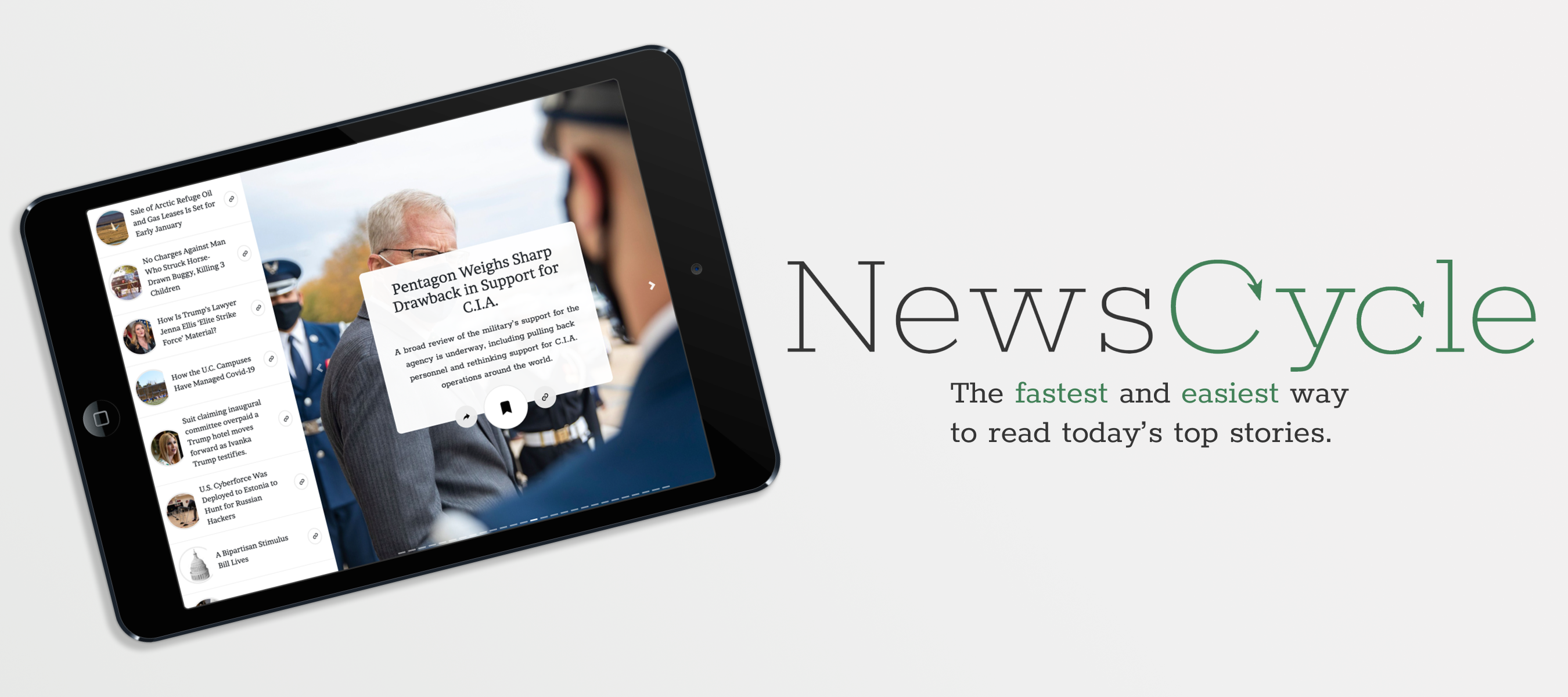
NewsCycle is an application designed to give you the fastest and easiest way to learn today’s top news stories created with React and MongoDB.
What would happen if we mixed the simplicity of Tinder profiles with reading thru the latest news?
That’s what we asked ourselves when we created NewsCycle, the fastest and easiest way to read today’s top stories.
Process
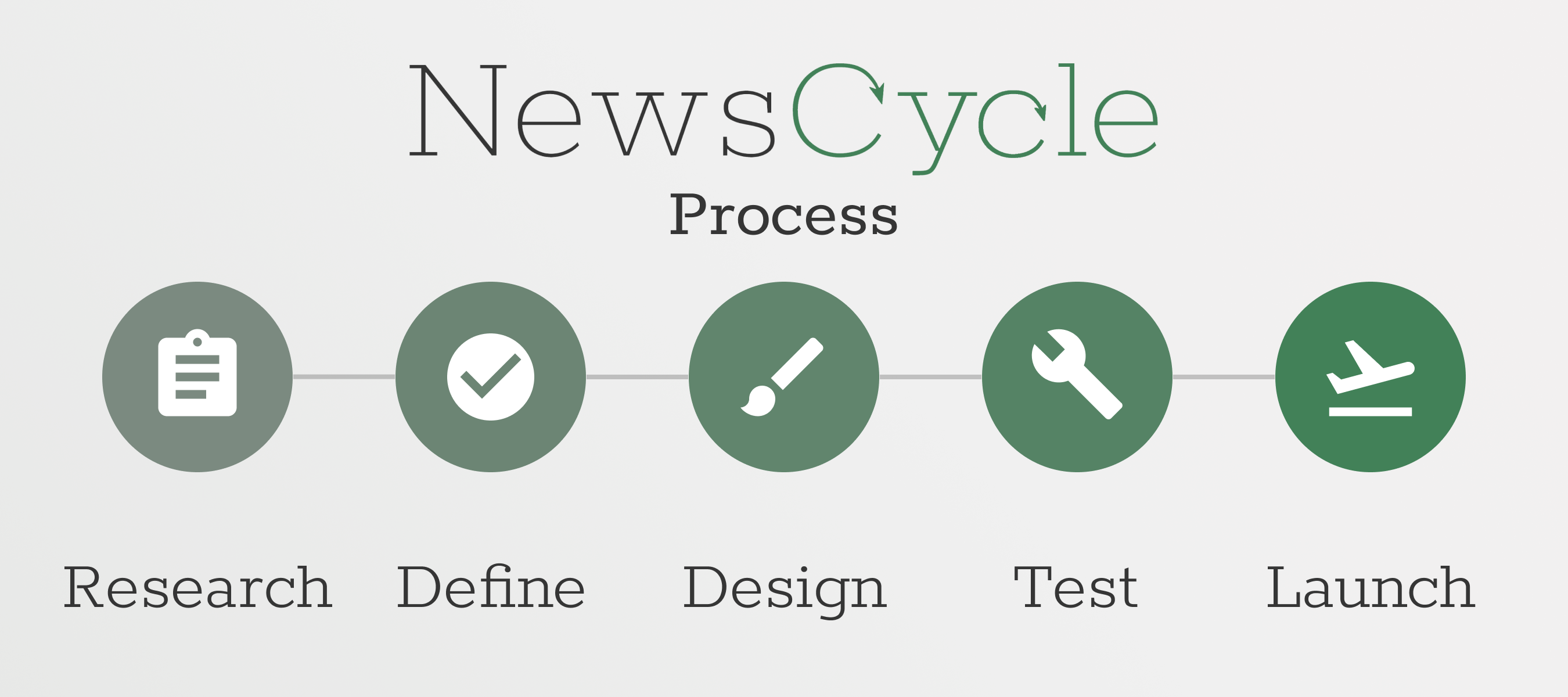
With a one month time period, we had a quick turnout time to create this application with a team of only four people. We divided our process into the following steps:
Research
As a full-stack team, we had to begin with researching both the technologies we wanted to use in this application, as well as defining the problem we wanted to solve with our application.
Problem
There is an over-abundance of “breaking news” every day, and with people having more access to technology than ever- it’s hard to stay focused to read which news stories matter.
Solution
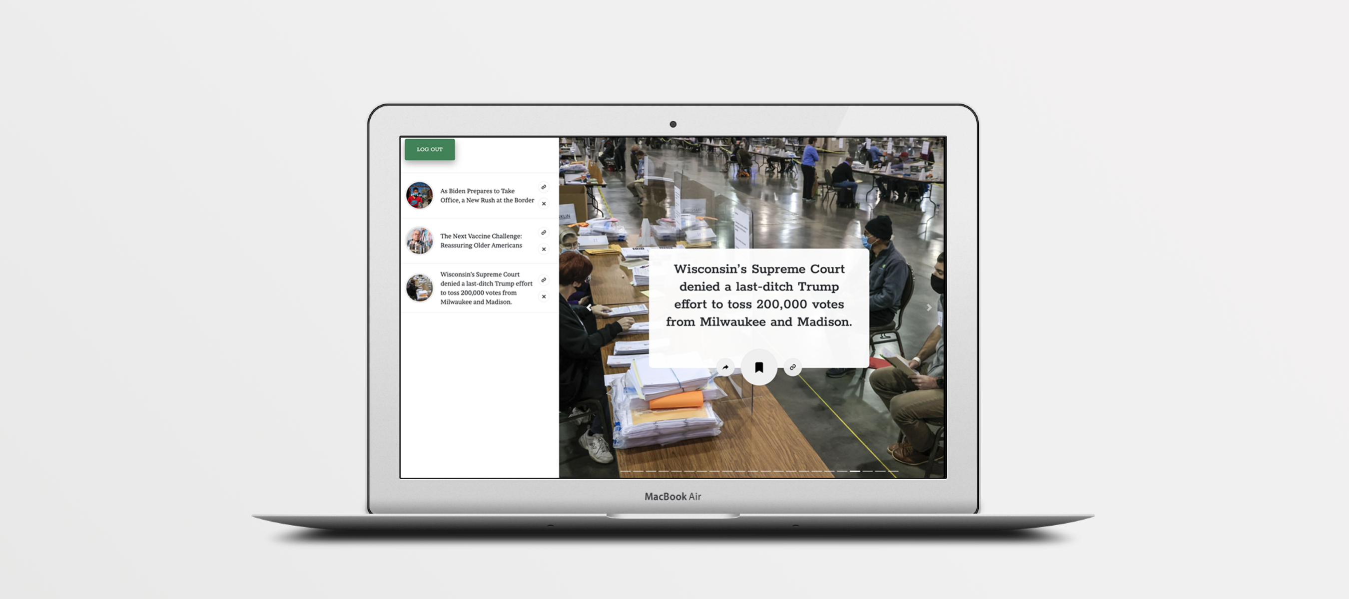
We want to create an immersive, minimalist application, where a user can quickly scroll thru each day’s top headlines and save articles to read later/send articles to a friend.
We quickly began researching existing API’s that could be used in developing the project- as this would effect the product’s design. We also had to check for existing applications to see how our product would differentiate in its accessibility. We decided the biggest issue we saw with most news applications was that a user would see too many news stories on the main page, feel overwhelmed, and then probably not actually read thru the article listings. We decided to counter this by creating a layout where the user would see only one article at a time.
Define
We decided to design the application with Sketch and Adobe Illustrator. The application would be built with a MERN structure- using Bootstrap and SASS to design the front end, Node and React to create the application, and MongoDB to hold the database of user data.
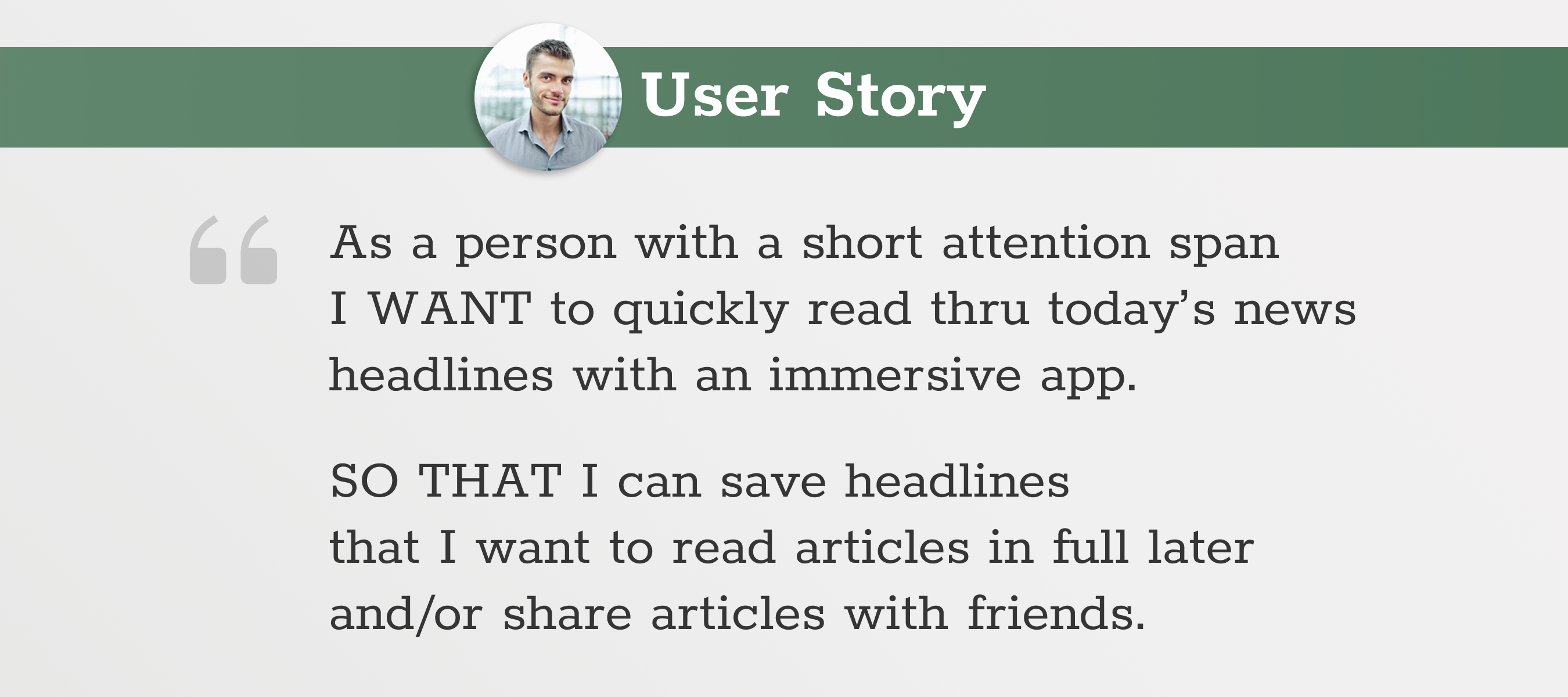
We built the application based on the following User Story:
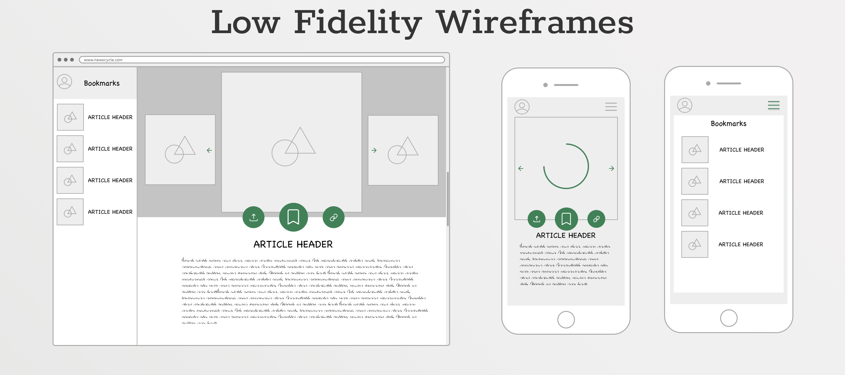
On a team of two, we then created the following wireframes after a long brainstorming session. You’ll note that after user testing- the design layout has changed significantly.
Design
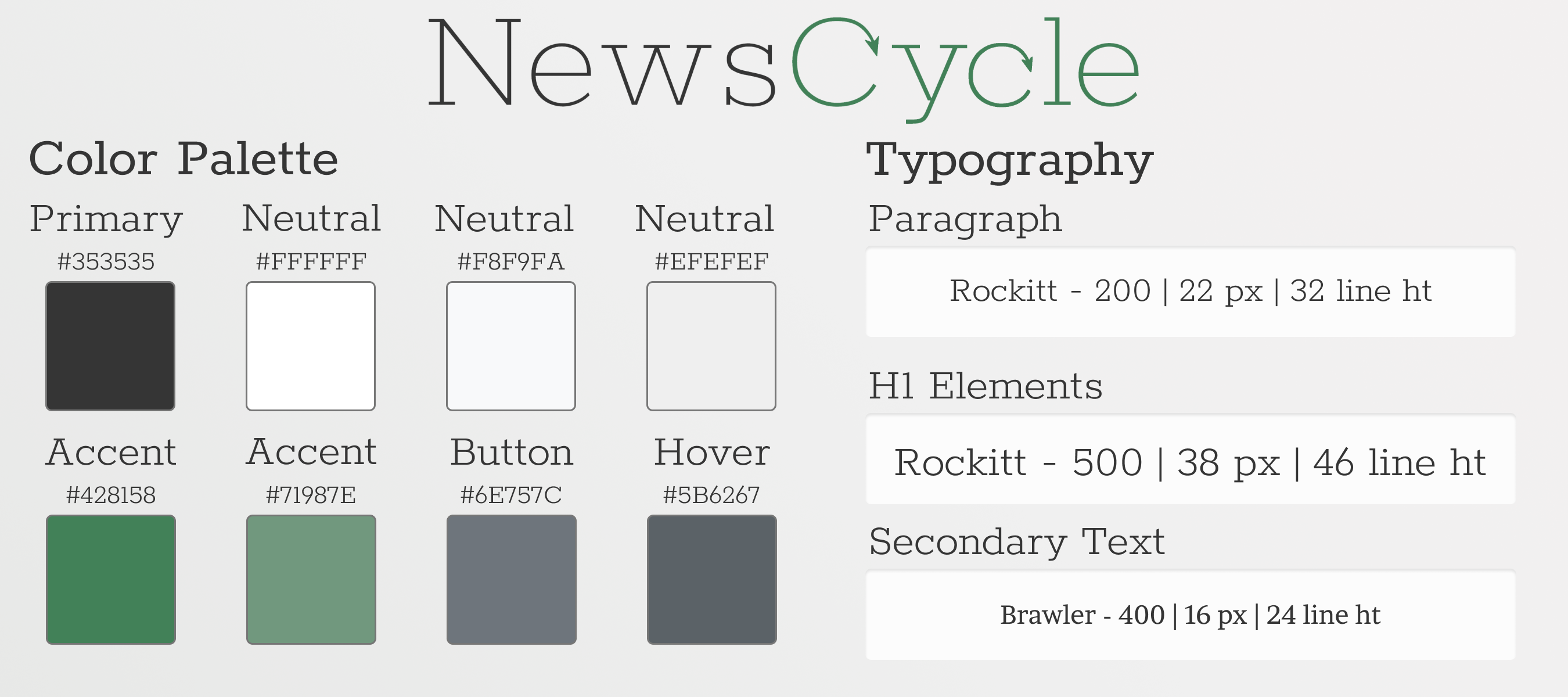
After finishing our wireframe and final prototypes, I created the following style guides. My brand for this project was “traditional minimalism” which is why I used as little font variation and color as possible, relying heavily on white space and imagery for the final designs.
Testing
After a base front-end design was developed in React, the front-end team began running user tests. I personally held one-on-one interviews with potential users and asked them about their thoughts of the design prototypes created on Sketch.
As I began showing mockups to user testing, I came to three conclusions which influenced a change in the design for our application:
- The original name (Newstly) was not translating to test audiences on explaining what the application did.
- Users preferred to use this application on their phone or tablet, rather than on a desktop computer. We learned that a “swiping” (touch commands) were necessary to making the experience enjoyable.
- The imagery for each article should be larger and easier to view, so that the user’s experience was more immersive while reading the news.
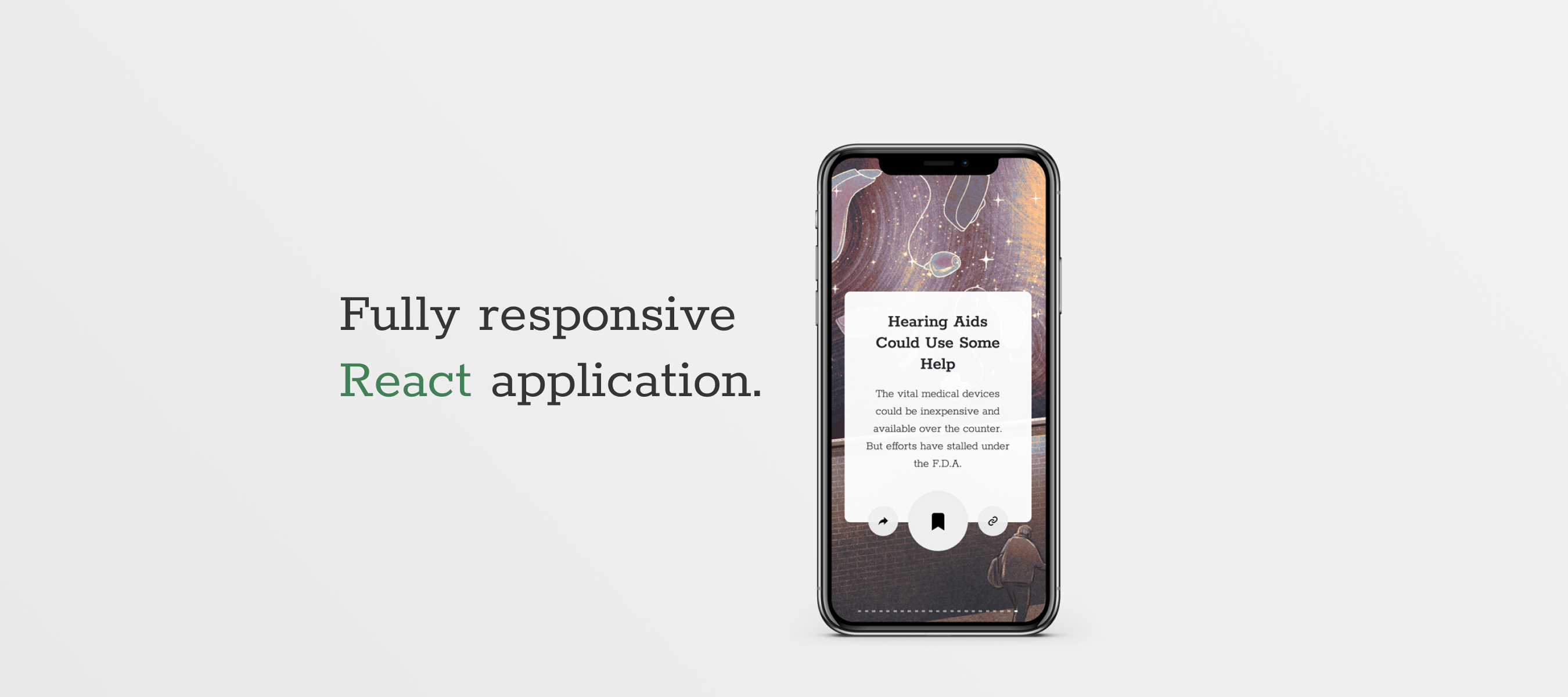
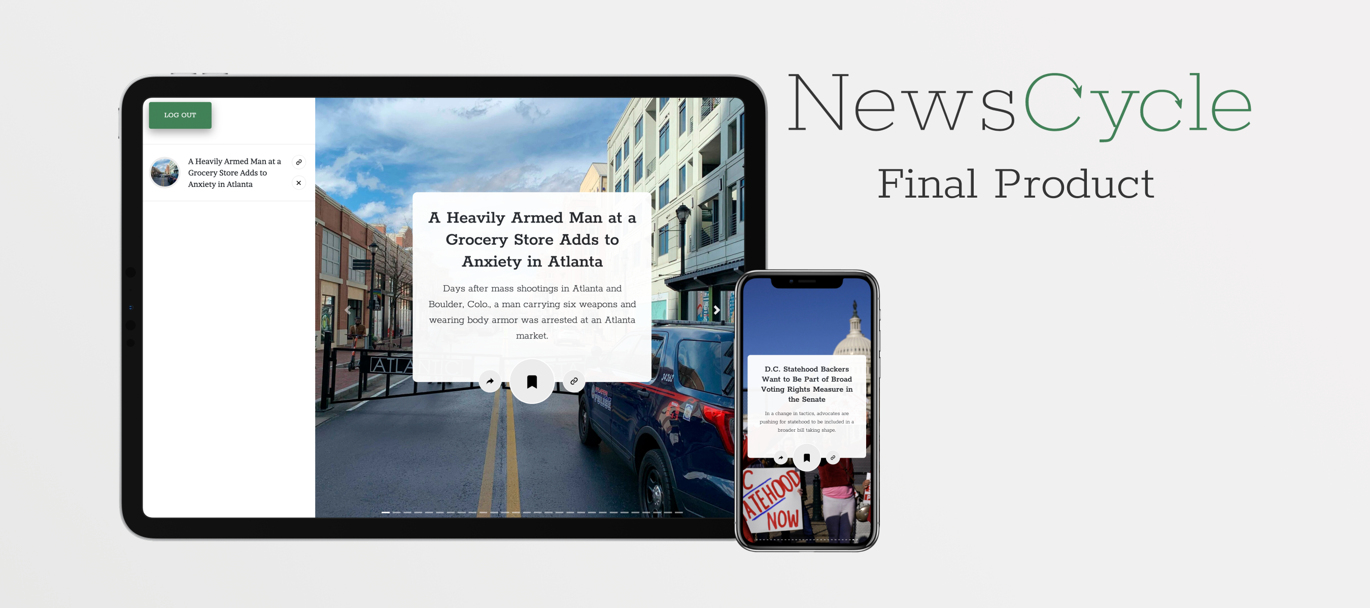
The front-end team worked together to quickly rebrand and redesign the application based on these notes. I created a swiping feature by repurposing Bootstrap React’s carousel component for the application, and gave each image a full screen view so that the experience was more immersive.
Launch and What’s Next
After a few sleepless nights, we launched our application. We deployed the application on Heroku and gave a live presentation the following day. We are thrilled to have received fantastic reviews from both users and from colleagues after launch.
Our future goal is to eventually recreate this application on React Native. We also want to design a tab where users can select extra news categories like sports and entertainment. Finally, we would like to add a user page with user information so that the application is a bit more “personal.”


