Floret
DESIGNED BY CHRISTOPHER BRYANT
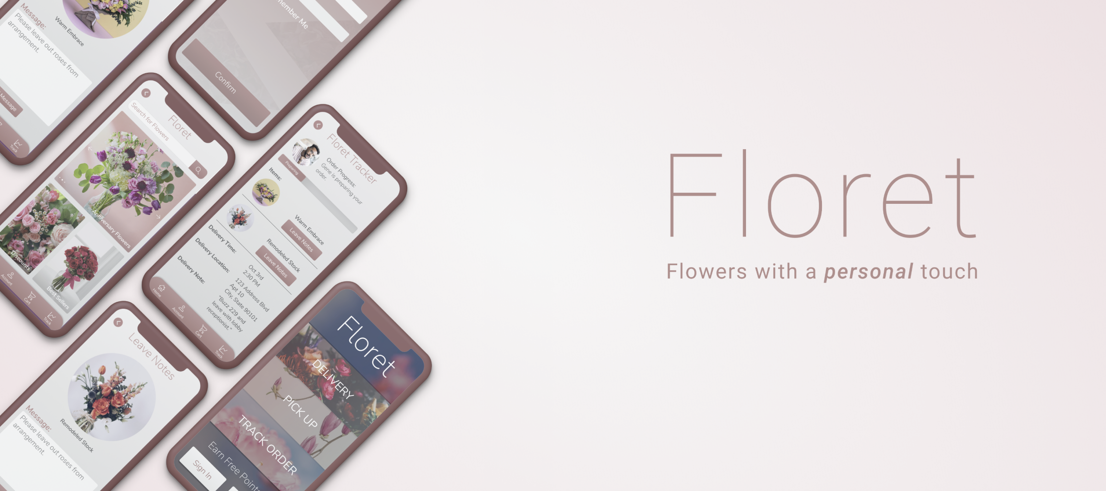
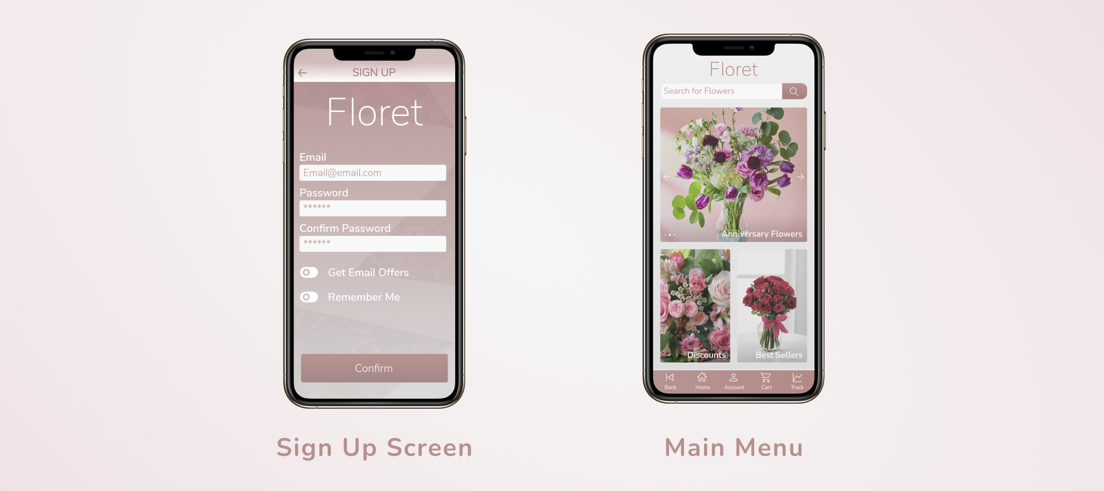
Floret was a flower delivery service start up in California. My task was to design a mobile application where a user could place bouquet orders, track their delivery, and send notes directly to florists.
Process
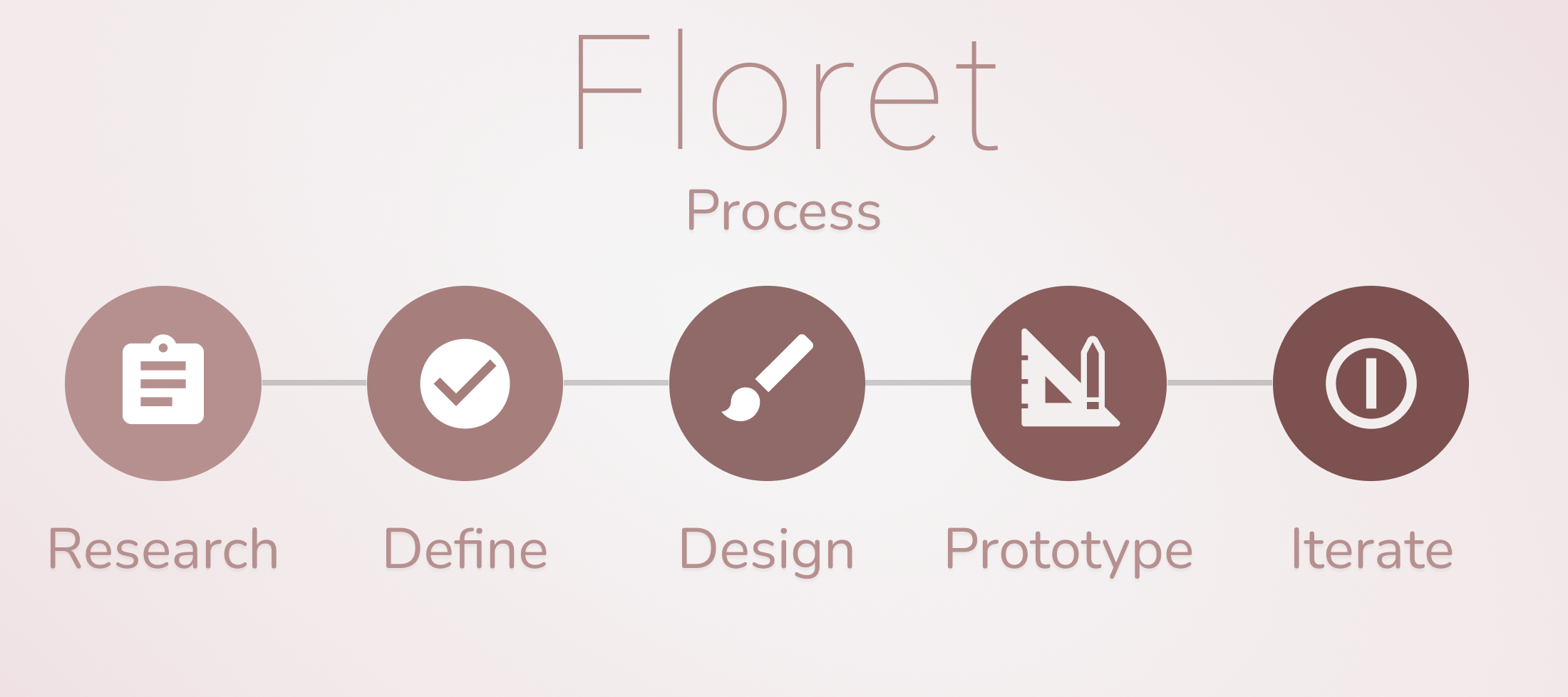
As the sole UX designer and researcher with a 5 month time frame, my goal was to create a user-centered design for Floret by spending extra time with researching and iterating designs based on usability testings. Thus, the process was divided into the following steps:
Research
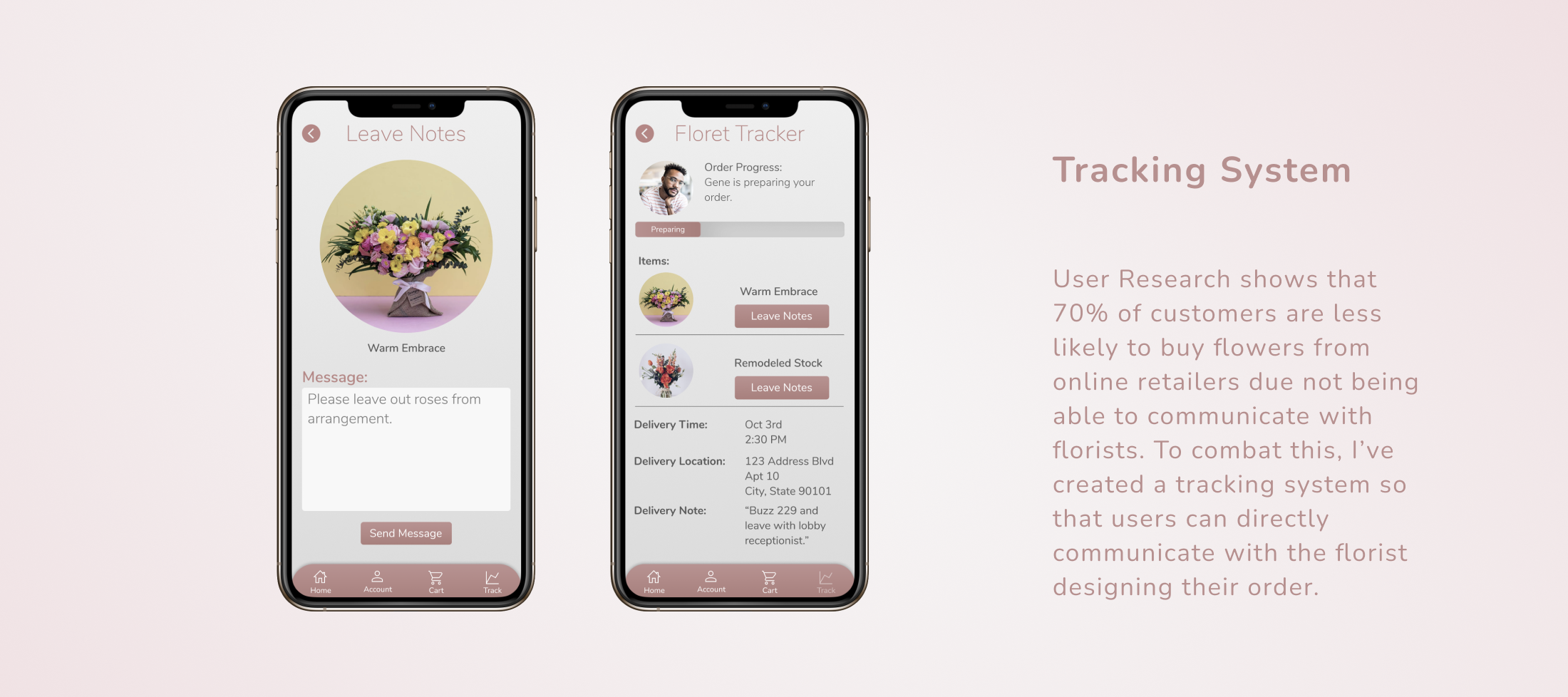
I spent a full month conducting user research with existing Floret customers through surveys and interviews to understand user’s experience with purchasing flowers online. My hypothesis was that a majority of users would buy flowers online solely as gifts for others, but I was surprised to find in my research that over half of customers also bought flowers through online delivery services for themselves. The largest complaint found in research was that users didn’t know who was designing their order, and felt like flowers never look like the stock photography used online.
Pain Points
While compiling user data, I also spent time conducting a competitive audit to understand what competitors were not addressing with current mobile applications. After composing the research and the competitive audit into a report to stakeholders, I moved on to clearly define how Floret’s application would fill the gap in the online flower delivery service market.
Define
I began the defining stage by creating multiple personas based on users interviewed during the research stage, so that investors and stakeholders could best understand their current and potential user base.
My biggest takeaway from research was that users needed a more personalized shopping experience when buying flowers online. I decided to look at brands who have developed a successful personalized experience in the mobile market- and thought to myself: “what if I combined the tracking system food apps (Dominos Pizza, Postmates, etc.) use- and reprocessed it into creating a personalized bouquet delivery service.”
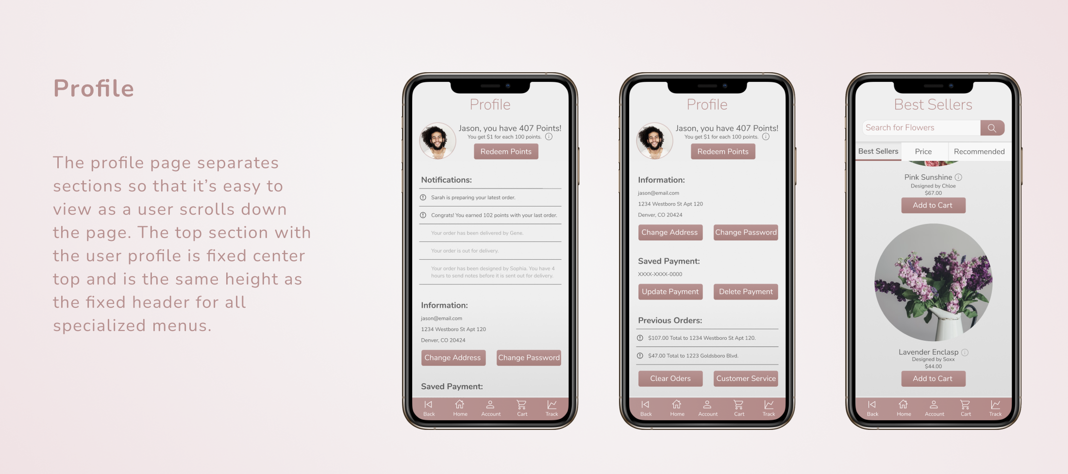
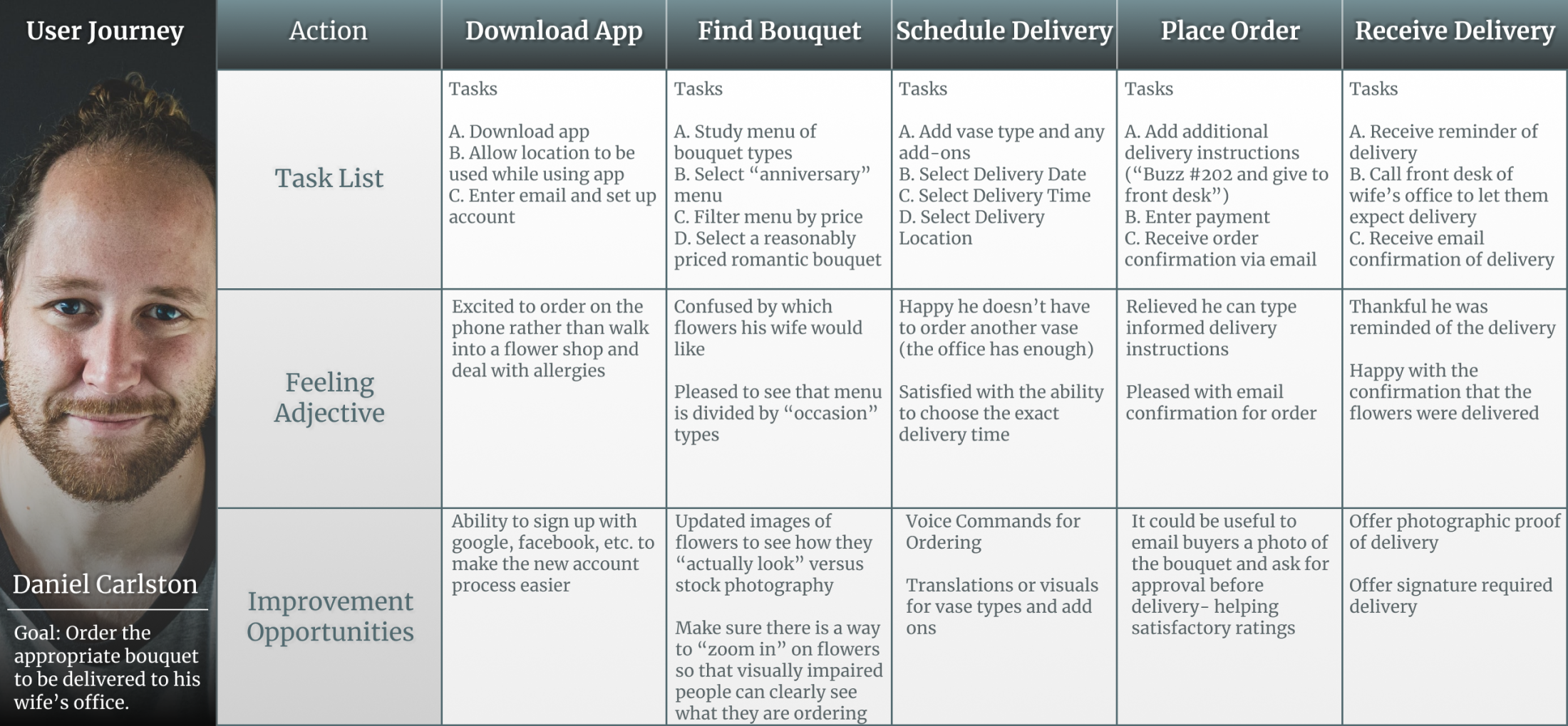
I decided Floret’s mobile application would include a delivery tracker, messaging system, and personalized menus that would help users feel like they had the experience of purchasing flowers in a store through the Floret mobile app. I communicated this system through the following user-journey:
Design
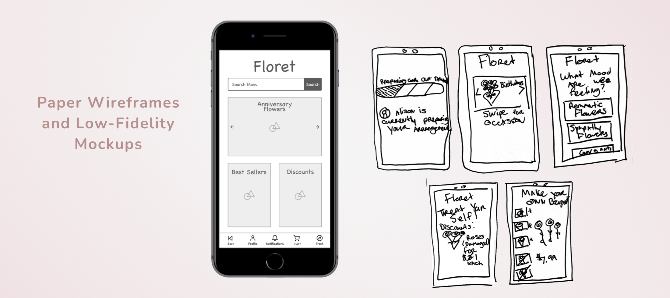
I began the design phase by multiple quick paper wireframes, iterating over and over multiple solutions for the design. I then created a low fidelity mock-ups to eventually generate into a prototype to conduct usability testings with.
Prototype
My goal was to create and test a low-fidelity prototype that would lead users to quickly purchase and track a flower order, without use of imagery or color. I wanted to ensure the landing page would be effective in getting users to sign up for an account with Floret. I held one-on-one usability testings with 5 users of different backgrounds and came across some major findings:
I added these features into the high-fidelity mockups, created a high-fidelity prototype, and then held usability testings with 6 different participants for the new prototype.
Iterate
Before sending a style sheet to developers, I spent the last month conducting usability testings and iterating the design based on findings. The biggest change during the high-fidelity mockups stage was for the cart page. Users wanted more options for changing delivery and payment, and felt like they couldn’t find the checkout button: which was increased to a larger size for the final build.
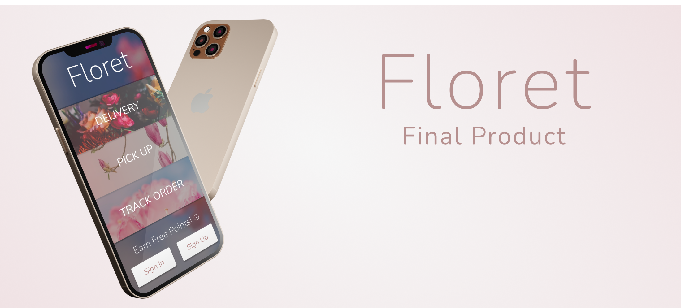
I presented the final design to stakeholders and received excellent feedback for an updated look for the Floret application.
Takeaways
During the 5-month period of this project, I learned some valuable insights and am grateful for my experience with Floret. My biggest lesson was the importance of setting time to conduct user research when creating user-centered design. This has been my biggest research-heavy project thus far, and it was such an excellent opportunity to understand that spending time to conduct user research actually saves time in the long run of a design project. Because I spent so much time clearly defining the problem that Floret’s new application would solve, the iteration phase was actually much shorter and I was able to ship out a highly-praised design at a very quick time period.


