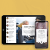
ArtistHop
DESIGNED BY CHRISTOPHER BRYANT AND PIERRE DIMITROV
BACK-END ENGINEERING BY OSCAR LEDEZMA AND STUART WONG
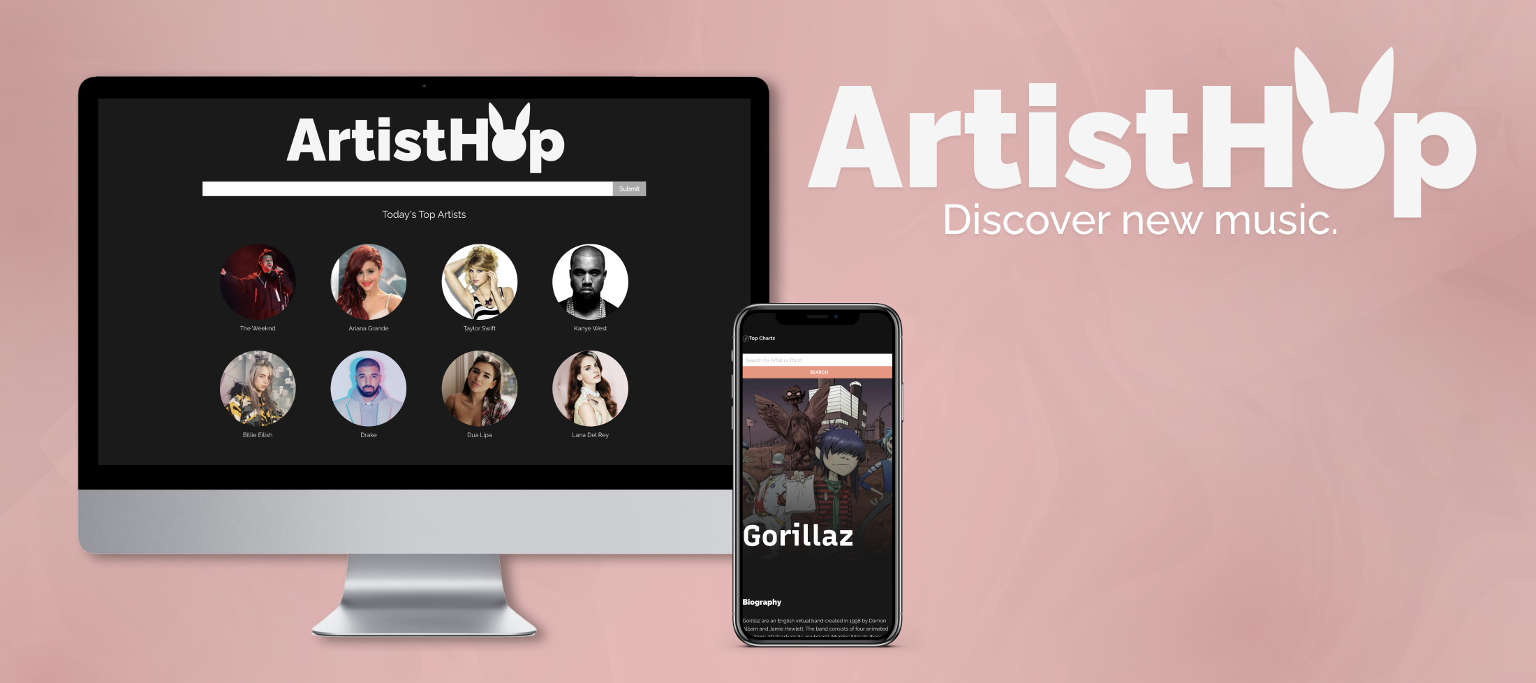
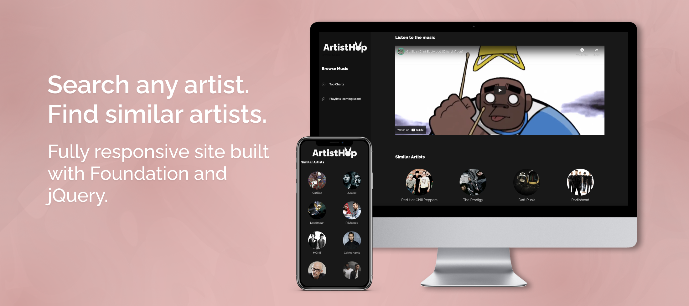
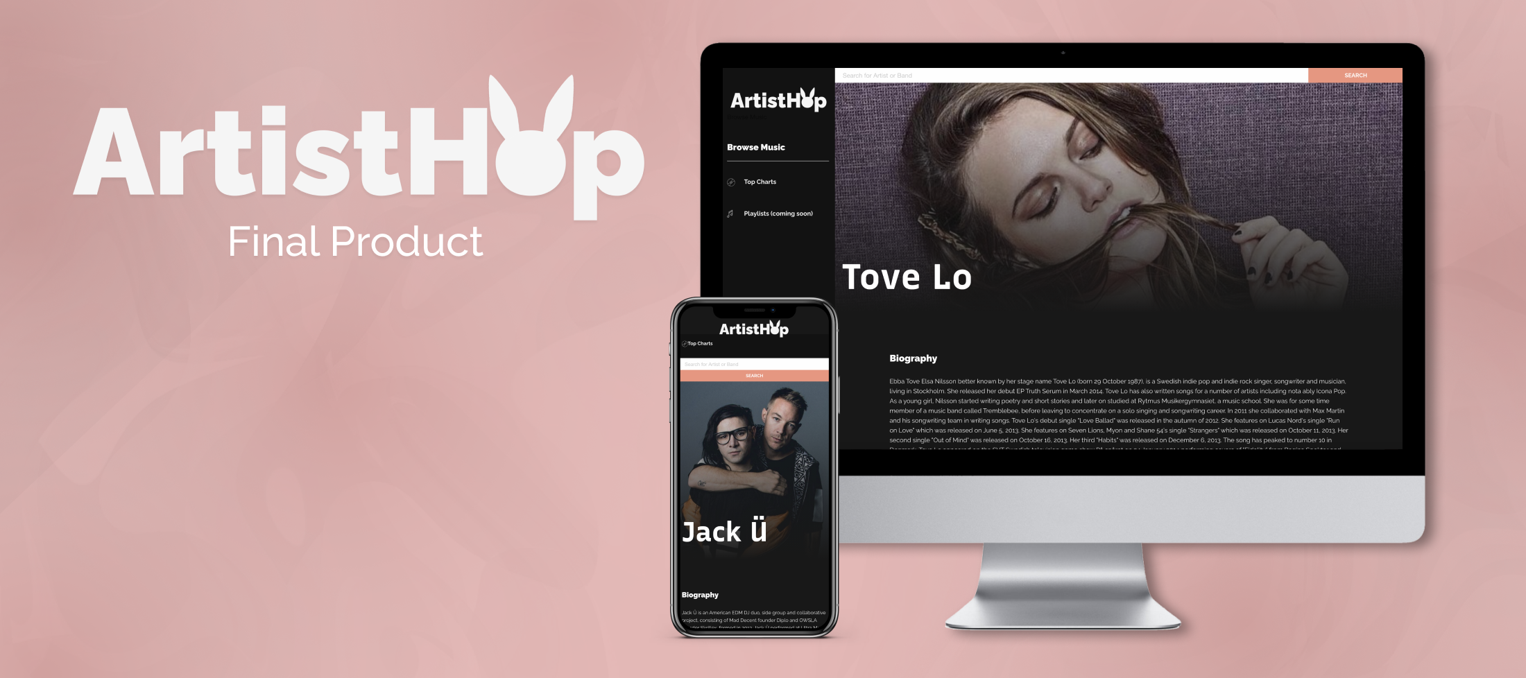
ArtistHop is a fully responsive web application built with Foundation and jQuery that helps users find new music. We used LastFM, AudioDB, and TasteDive’s APIs to generate the ultimate database of music. Users can check a daily updated list of the top trending artists, as well as search for any artist and find similar music taste.
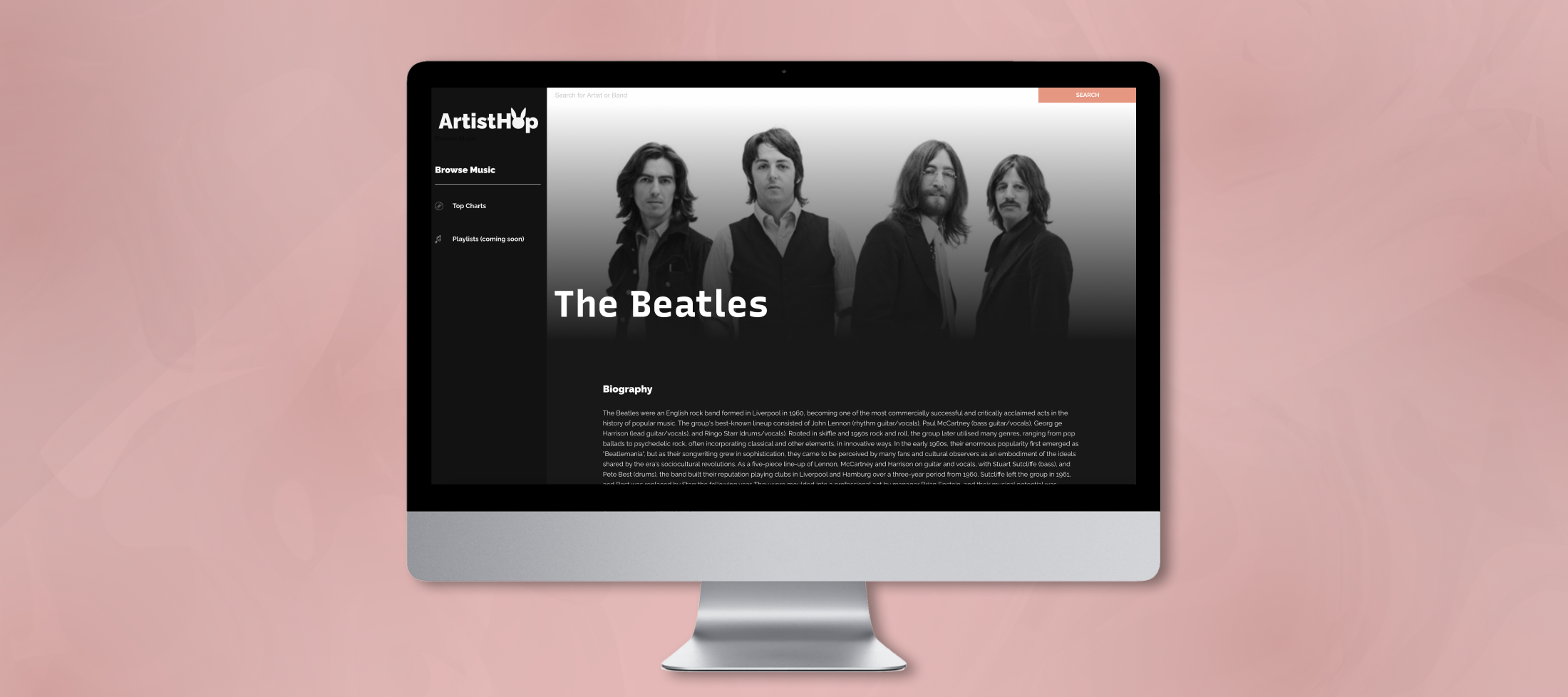
We wanted to create the ultimate experience for music lovers. On each artist page, you can find a thoroughly written biography and a music video per artist. Underneath- you’ll find a list of similar artists waiting to be discovered. Because we combined various databases that aren’t influenced by record labels, ArtistHop is the best way to find new music artists!
Process
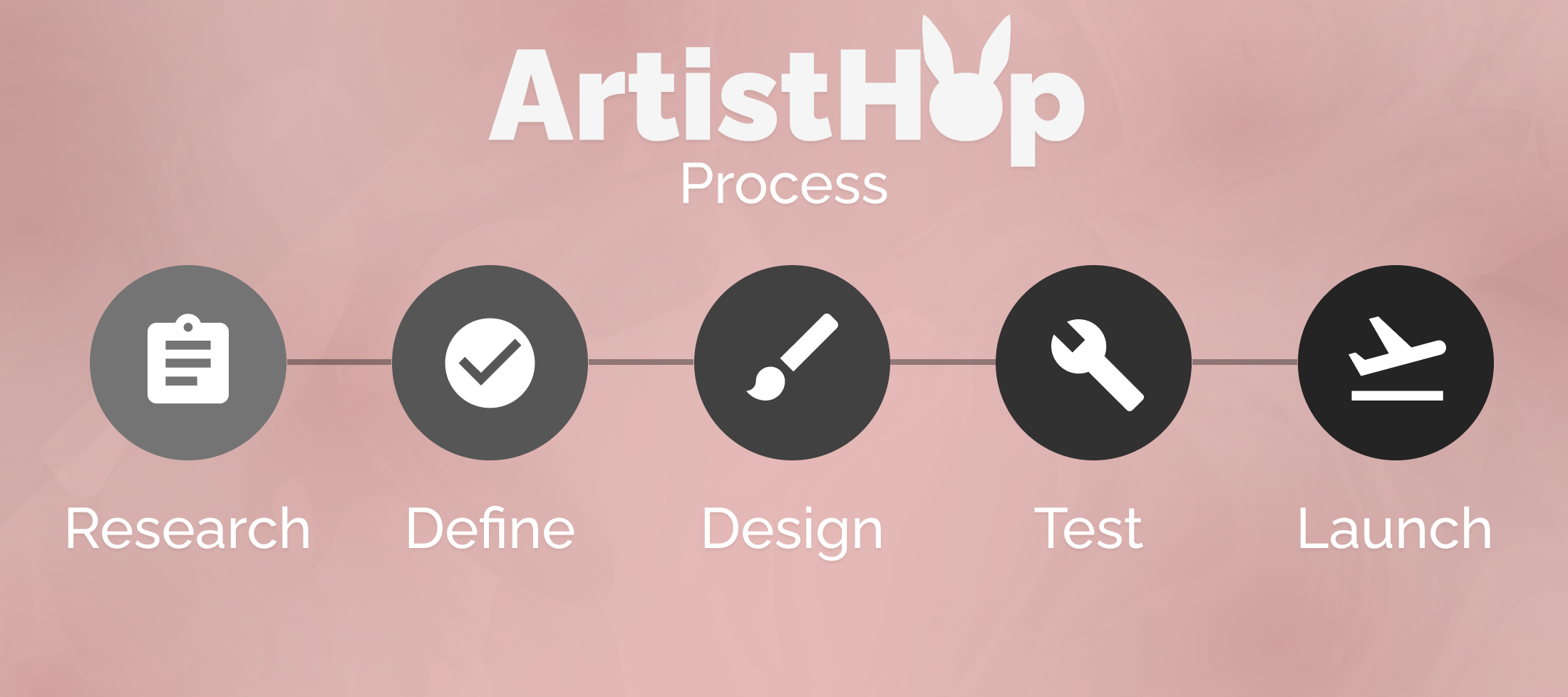
With only a two week timeframe, we had a very short period to create this application with a team of only four people. This means we had a quick time to create an application, and even less time to conduct user research and testing. Thus, we divided our process into the following steps:
Research
Both the back-end and front-end teams started this project by conducting research on multiple music APIs. Even though my role was a UI Designer and front-end engineer: I had to focus my initial research on understanding which data would be available on musicians. The data available via APIs wouldn’t just determine which artist data would be available to display, but also the quality and ratio of images that we could use for the application’s design. After researching available music APIs, we determined our application’s function:
Problem
Music lovers are always looking to find new music. They want to find musicians and find similar artists, without having to look through a music list that is influenced by record labels.
Solution
We want to create an interface that can help users search musicians and find similar artists while providing a non-biased database that is generated off of multiple APIs.
Define
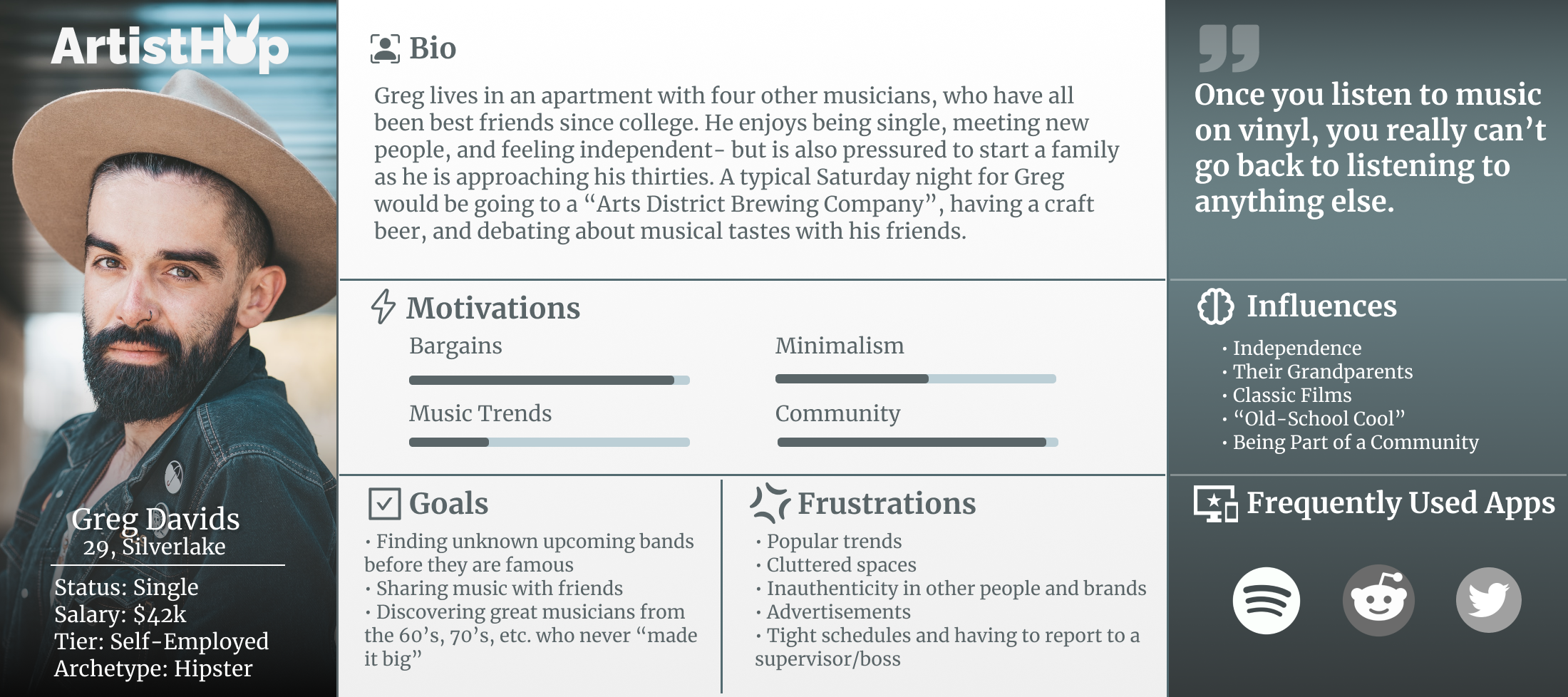
After deciding the purpose of our application, I worked on understanding and defining our target user base. I quickly conducted user surveys on social media, targeting people aged 20-40 interested in music, to understand what information is most important when discovering new artists. Based on the data generated from the surveys, I created our target user base personas, such as the following:
Design
Due to our quick deadline, the design and define processes tended to overlap in this project. On a team of two, we had to quickly turn over a design for the application with Sketch to the back-end engineers before research data on our target demographic was compiled.
The application was required to be built on Foundation. As a longterm Bootstrap user, I found the challenge of using a new interface library thrilling, albeit overwhelming. Foundation’s grid system heavily influenced our final design, and I have fallen in love with the library and the ease it adds to responsive web design.
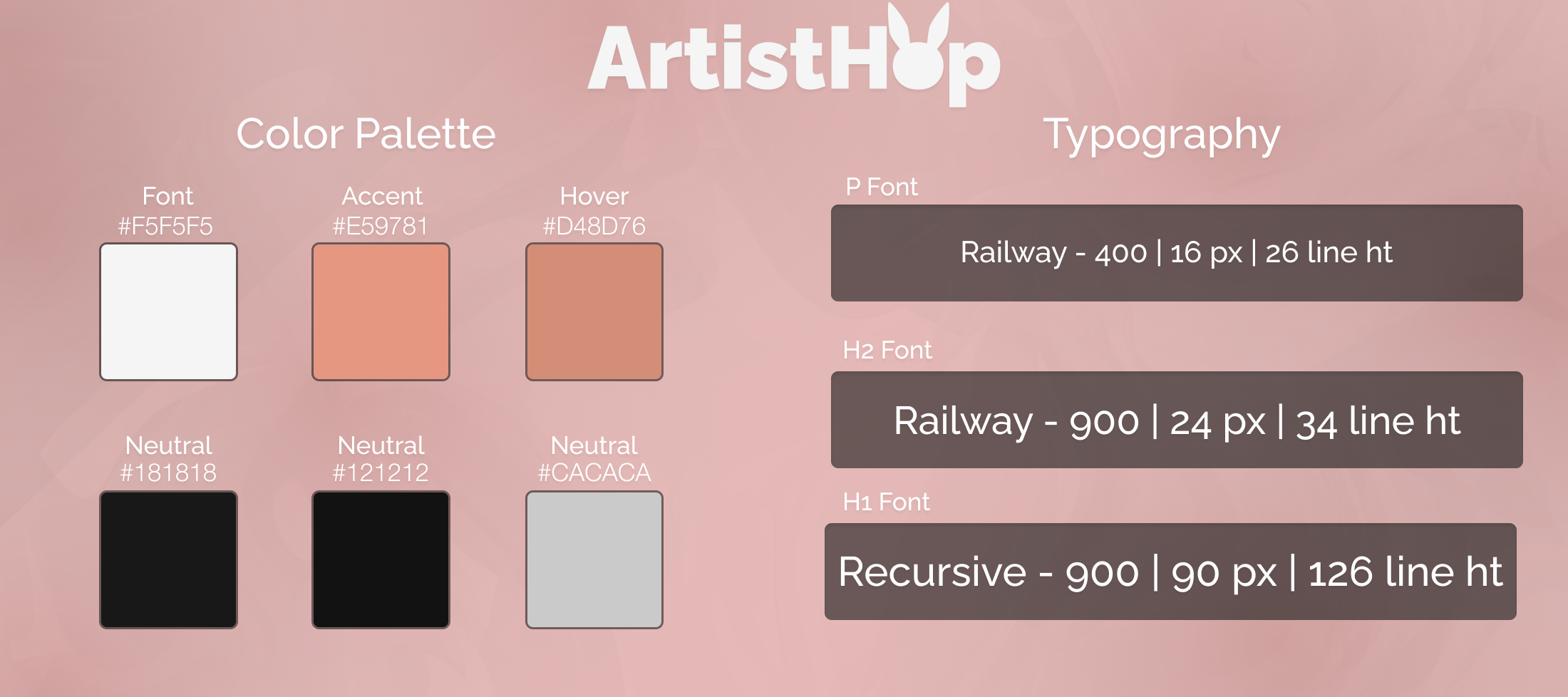
Our brand for the project was “Rock Star Minimalism.” We decided on a dark interface- as user research showed that dark interfaces are easier to navigate with lots of imagery. Because the project included thousands of artists, each with their unique artwork and promotional images, we decided to go with as minimal color in the interface design as possible.
Testing
Testing for this project required a collaboration effort between the back-end and front-end teams, since most of the UI design required musician imagery that was generated by API calls. We had a running build developed by day 10, and had four days to test and debug the project before launch.
Most of the user testing we conducted were usability testing. User testing provided one major design change: users (specifically mobile testers) couldn’t figure out how to navigate back to the “Top Charting Artists” page. We had to add a new “Top Charts” section to the left hand navigation, to help ease confusion. Most of the other features changed during usability testing were small debugging issues, since our database was navigating through multiple APIs.
Launch and What’s Next
We were thrilled by the final project generated in such a short time period. During demonstration, the UI design received incredibly strong praise for its minimalist approach to showing a heavy amount of data.
Our future plans for this application include adding a top music tracks page, top albums page, adding a music streaming widget on the left navigation side with the Spotify API, and adding user accounts so that user can create saved lists of artists that they discover.


